Choropleth Counties
Choosing how to display data is often the most difficult part of the data visualization process. Would a bar chart be superior to a pie? Perhaps a scatter would tell more than two bar charts? One of the most difficult of these choices is between filled maps (choropleth) and shapes.


Choosing how to display data is often the most difficult part of the data visualization process. Would a bar chart be superior to a pie? Perhaps a scatter would tell more than two bar charts? One of the most difficult of these choices is between filled maps (choropleth) and shapes.
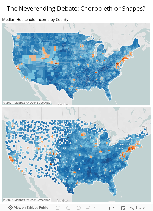
Choropleth maps have several advantages. First, they avoid overlap and because of it they are usually very neat and beautiful. Choropleth maps also tend to make it easy to spot trends geographically, like the clusters of major cities in the household income map above.
However, shapes also have some interesting traits. First of all, it can be much easier to spot small outliers. You may notice how Los Alamos County, NM stands out in the bottom view, but is nearly invisible in the top view. Shapes also have the relative advantage of not distorting by size, because they give equal weight to each mark. This can be frustrating though, since they can overlap, as in the eastern US with this map.
Regardless of your choice, it is relatively easy to create both types of map in Tableau. For the choropleth map, you will need a polygon file, but once you have that it is a simple data blend away. If you have an interest, you can download the US counties polygon file used to make this map, courtesy of Alan Smithee.
Subscribe to our blog
Get the latest Tableau updates in your inbox.