
Now Available in 2024.1 Release: Tableau Pulse, Metrics Layer, Viz Navigation, and More
Enhance your Tableau data experience, scale insights, and gain flexibility in your data analytics journey.
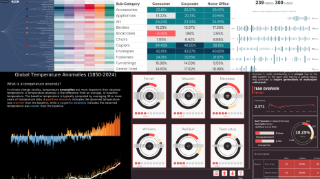
 Tableau Pulse
How Tableau Pulse powered by Tableau AI is Reimagining the Data Experience
The future of analytics is personalized, contextual, and smart. Tableau Pulse
Tableau Pulse: Proactive Answers to Your Common Business Questions with Automated Insights
 Learn how the Tableau Pulse Insights platform delivers guided, digestible, and personalized insights—right in your flow of work.
 Tableau Pulse
The Power of a Metrics Layer—and How Your Organization Can Benefit From It
 Learn what is a metrics layer, the benefits of a business glossary of KPI definitions, and how the Metrics Layer helps analysts and the business user experience in Tableau Pulse.
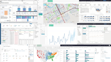 Product
26 Tableau Features to Know from A to Z
 Learn 26 Tableau features that will boost your productivity, enhance data governance, and make data insights more scalable across your organization.
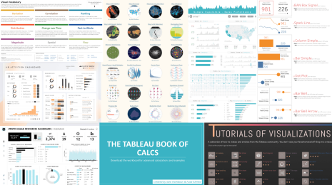 Tableau Public
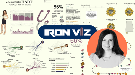
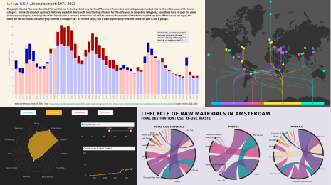
8 Most-Favorited Data Visualizations on Tableau Public
 With more than 8 million data vizzes now on Tableau Public, explore the most-favorited vizzes of all time and the authors who shared them.
The Latest
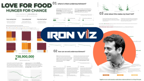
Meet Iron Viz 2024 Finalist Chris Westlake
 April 22, 2024
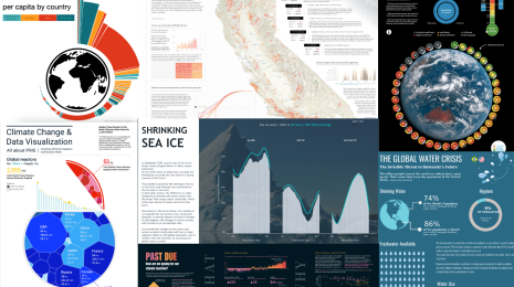
Visualizing Climate Change: Expert Tips from #TheSDGVizProject Leaders
 April 22, 2024
DataFam Roundup: April 15–19, 2024
 April 19, 2024
Meet Iron Viz 2024 Finalist Jessica Moon
April 15, 2024
DataFam Roundup: April 8–12, 2024
April 12, 2024
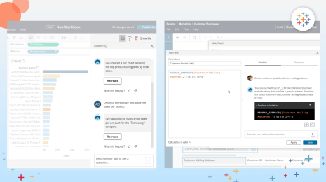
Who is Einstein Copilot for Tableau for?
 April 10, 2024
Subscribe to our blog
Get the latest Tableau updates in your inbox.