
Data helps find opportunities and resolve misunderstandings. These 5 visualizations—the works of Snow, Rosling, Minard, Nightingale, and Priestley—are evidence of that. They influenced people’s thoughts and actions at critical points in history, making an impact on the world around us.
We can learn a lot about the future of data visualization by looking at the past. These visualizations are still relevant today and continue to teach us about the power of data storytelling.
Download the whitepaper to learn more.
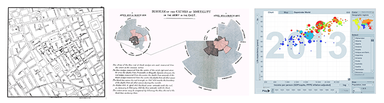
5. London Cholera Map by John Snow
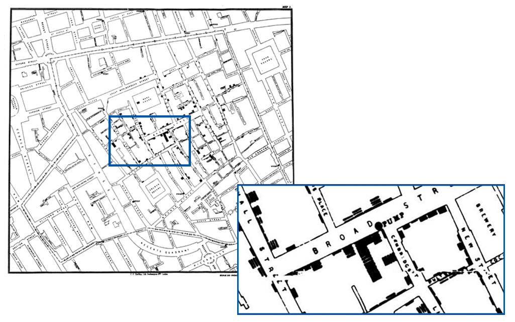
1854. London. Cholera strikes. In just 10 days, over 500 people have died in one neighborhood. The mysterious cluster of deaths is especially terrifying because no one understands the source.
No one besides John Snow, an epidemiologist who believed that the water supply was spreading the disease. He plotted every death on a map with ingenious mapped bar charts (see above) and was able to show that the closer to the Broad Street water pump he plotted, the greater the number of deaths.
This was positive proof that cholera was caused by contaminated water. Determining the source helped end the epidemic and save millions of lives.
4. Gapminder by Hans Rosling
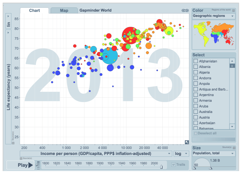
The Swedish scientist Hans Rosling had been working with developmental data for over 30 years—but it took a great visualization and a 2007 TED talk for him to share his passion with the world.
His original viz (now one of many) shows the relationship between income and life expectancy in 200 countries over 200 years, in just four minutes. The data is simple but Rosling’s visual storytelling transformed how people approach data presentation.
3. March on Moscow by Charles Minard
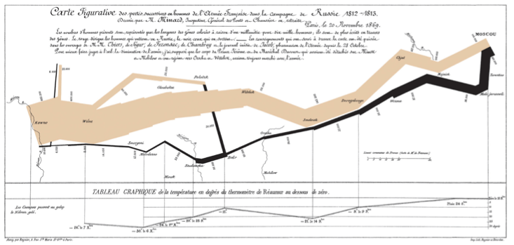
In 1812, Napoleon marched to Moscow to conquer the city. 98% of his soldiers died. Fifty years later, while his country yearned for their former Imperial glory, the Parisian engineer Charles Minard chose to remind his country of the horrors of war with data. The simple but fascinating temperature line below the visualization shows how cold ultimately defeated Napoleon’s army. This viz still inspires those who see it to ponder the true cost of war.
2. War Mortality by Florence Nightingale
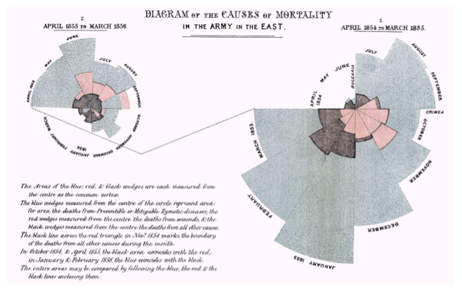
1855. The Crimea. Britain is fighting a battle with both Russia and disease. As a nurse, how do you convince an army to invest in hospitals and healthcare instead of guns and ammunition?
Florence Nightingale told her story with data by showing the staggering amount of deaths due to preventable disease (shown in blue/grey). This visualization helped convince the British army to make sanitation a priority, saving lives in the process.
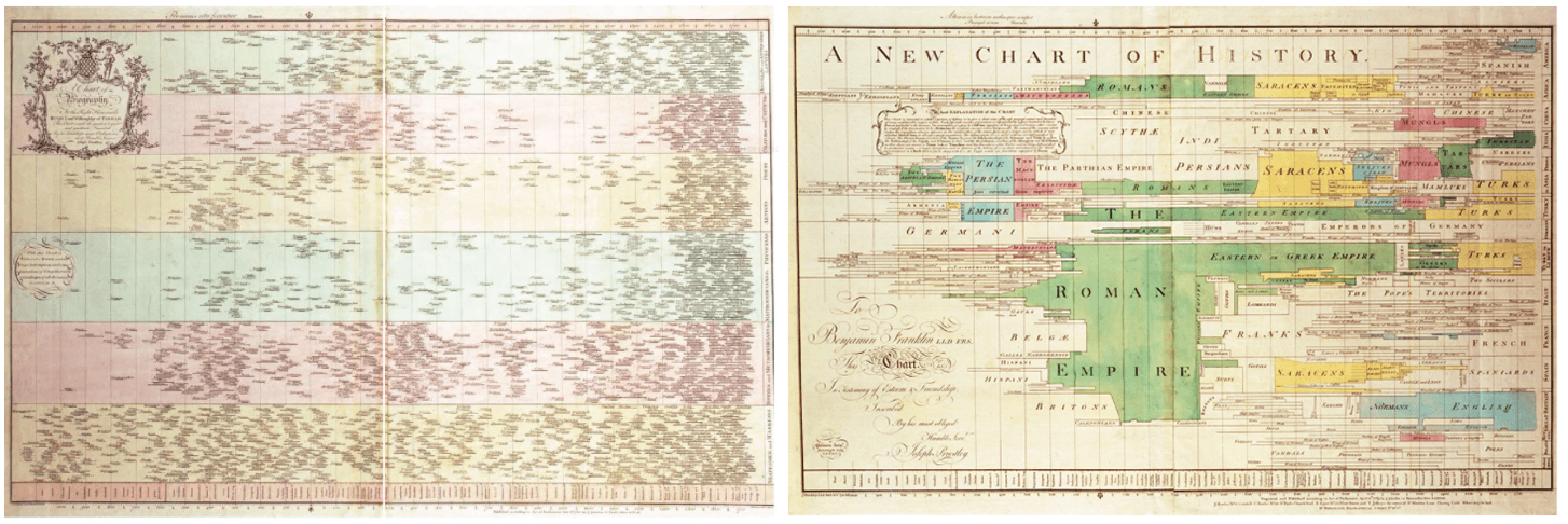
1. Chart of Biography by Joseph Priestley
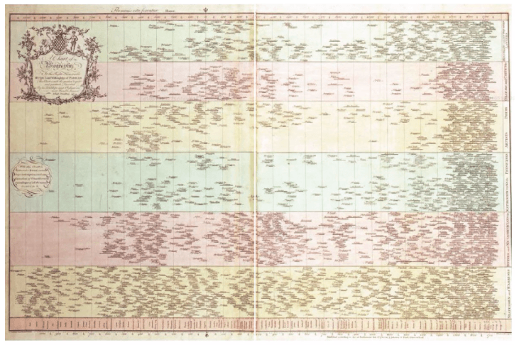
These bars on these timeline charts showed the lifespan of 2,000 famous people from 1200 BCE to 1800 AD.
The 18th century English educator and polymath Joseph Priestley had an ambitious goal: to teach his students the relationship between the nations of the past and the people that defined them. His creation ended up becoming two separate, but related views.
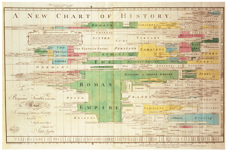
Using the same X-axis as the biography chart, this visualization shows the history of the major civilizations of the world over the same time period.
Together, they weave an intricate story. They explain and document both the rise and fall of empires, and the unique thinkers that defined those nations. Notice, as an example, the clusters of biographies and how they correlate to the major moments in human history—the Greeks, the Romans, the Enlightenment, etc.
Additional resources
Learn more about data visualization with these free resources: