Data visualisation is the graphical representation of information and data. By using visual elements like charts, graphs and maps, data visualisation tools provide an accessible way to see and understand trends, outliers and patterns in data.
In the world of big data, data visualisation tools and technologies are essential for analysing massive amounts of information and making data-driven decisions.
The advantages and benefits of good data visualisation
Our eyes are drawn to colours and patterns. We can quickly identify red from blue, square from circle. Our culture is visual, including everything from art and advertisements to TV and films.
Data visualisation is another form of visual art that grabs our interest and keeps our eyes on the message. When we see a chart, we quickly see trends and outliers. If we can see something, we internalise it quickly. It’s storytelling with a purpose. If you’ve ever stared at a massive spreadsheet of data and couldn’t see a trend, you know how much more effective a visualisation can be.
Big data is here and we need to know what it says
As the “Age of Big Data” kicks into high gear, visualisation is an increasingly key tool to make sense of the trillions of rows of data generated every day. Data visualisation helps to tell stories by curating data into a form that is easier to understand, highlighting the trends and outliers. A good visualisation tells a story, removing the noise from data and highlighting the useful information.
However, it’s not simply as easy as just dressing up a graph to make it look better or slapping on the “info” part of an infographic. Effective data visualisation is a delicate balancing act between form and function. The plainest graph could be too boring to catch any notice or it could make a powerful point; the most stunning visualisation could utterly fail at conveying the right message or it could speak volumes. The data and the visuals need to work together, and there’s an art to combining great analysis with great storytelling.
Why data visualisation is important for any career
It’s hard to think of a professional industry that doesn’t benefit from making data more understandable. Every STEM field benefits from understanding data – and so do fields in government, finance, marketing, history, consumer goods, service industries, education, sports and so on.
While we’ll always wax poetic about data visualisation (you’re on the Tableau website, after all) there are practical, real-life applications that are undeniable. And, since visualisation is so prolific, it’s also one of the most useful professional skills to develop. The better you can convey your points visually, whether in a dashboard or a slide deck, the better you can make use of that information.
The concept of the citizen data scientist is on the rise. Skill sets are changing to accommodate a data-driven world. It is increasingly valuable for professionals to be able to use data to make decisions and use visuals to tell stories of when data informs the who, what, when, where and how. While traditional education typically draws a distinct line between creative storytelling and technical analysis, the modern professional world also values those who can cross between the two: data visualisation sits right in the middle of analysis and visual storytelling.
Examples of data visualisation in action
Of course, one of the best ways to understand data visualisation is to see it. What a crazy concept!
With public data visualisation galleries and data everywhere online, it can be overwhelming to know where to start. We’ve collected 10 of the best examples of data visualisation of all time, with examples that map historical conquests, analyse film scripts, reveal hidden causes of mortality and more.
Tableau’s own public gallery shows off loads of visualisations made with the free Tableau Public tool, we feature some common starter business dashboards as usable templates, and Viz of the Day collects some of the best community creations. Plus, there are tonnes of great blogs and books about data visualisation containing excellent examples, explanations and information about best practices.
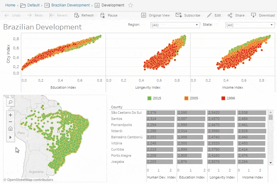
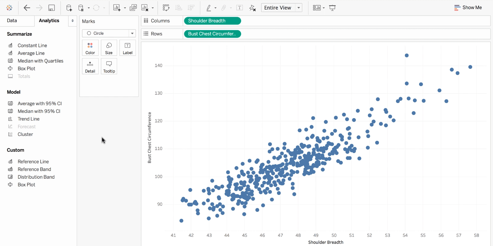
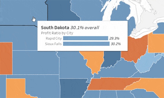
The different types of visualisations
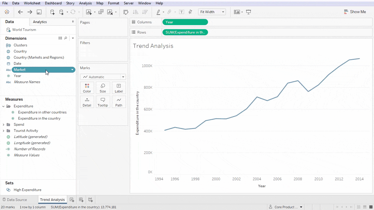
When you think of data visualisation, your first thought probably immediately goes to simple bar graphs or pie charts. While these may be an integral part of visualising data and a common baseline for many data graphics, the right visualisation must be paired with the right set of information. Simple graphs are only the tip of the iceberg. There’s a whole selection of visualisation methods for presenting data in effective and interesting ways.
Common general types of data visualisation:
- Charts
- Tables
- Graphs
- Maps
- Infographics
- Dashboards
More specific examples of methods of visualising data:
- Area chart
- Bar chart
- Box-and-whisker plots
- Bubble cloud
- Bullet graph
- Cartogram
- Circle view
- Dot distribution map
- Gantt chart
- Heat map
- Highlight table
- Histogram
- Matrix
- Network
- Polar area
- Radial tree
- Scatter plot (2D or 3D)
- Streamgraph
- Text tables
- Timeline
- Treemap
- Wedge stack graph
- Word cloud
- And any mix-and-match combination in a dashboard!
Learn more about data visualisations (and how to create your own)
If you’re feeling inspired or want to learn more, there are tons of resources to tap into. Data visualisation and data journalism are full of enthusiastic practitioners eager to share their tips, tricks, theory and more.
Blogs about data visualisation are a perfect place to start
See our list of great data visualisation blogs full of examples, inspiration and educational resources.
The experts who write books and teach classes about the theory behind data visualisation also tend to keep blogs where they analyse the latest trends in the field and discuss new vizzes. Many will offer critiques on modern graphics or write tutorials on creating effective visualisations.
Others will collect many different data visualisations from around the web in order to highlight the most intriguing ones. Blogs are a great way to learn more about specific subsets of data visualisation or to look for relatable inspiration from well-done projects.
Learn about historical examples and theory from books
Read our list of great books about data visualisation theory and practice.
While blogs can keep up with the changing field of data visualisation, books focus on where the theory stays constant. Humans have been trying to present data in a visual form throughout our entire existence. One of the earlier books about data visualisation, originally published in 1983, set the stage for data visualisation to come and still remains relevant to this day.
More current books still deal with theory and techniques, offering up timeless examples and practical tips. Some even take completed projects and present the visual graphics in book form as an archival display.
There are loads of free courses and paid training programmes
There are plenty of great paid and free courses and resources on data visualisation out there, including right here on the Tableau website. There are videos, articles and white papers for everyone from beginner to data rockstar. When it comes to third-party courses, however, we won’t provide specific suggestions in this article at this time.
A note on data visualisation tools and software
There are dozens of tools for data visualisation and data analysis. These range from simple to complex, from intuitive to obtuse. Not every tool is right for every person looking to learn visualisation techniques, and not every tool can scale to industry or enterprise purposes. If you’d like to learn more about the options, feel free to read up here or dive into detailed third-party analyses like the Gartner Magic Quadrant.
Also, remember that good data-visualisation theory and skills will transcend specific tools and products. When you’re learning this skill, focus on best practices and explore your own personal style when it comes to visualisations and dashboards. Data visualisation isn’t going away any time soon, so it’s important to build a foundation of analysis, storytelling and exploration that you can carry with you regardless of the tools or software you end up using.