Tableau Dashboard Showcase
Tableau empowers people to find insights in their data, create beautiful and intuitive dashboards, and share them with their organizations and broader community. These are some of our favorite Tableau data visualizations.
Featured Visualizations


Create and share on Tableau Public
Join the newsletter and find daily inspiration with the Viz of the Day. Yours could be featured next!

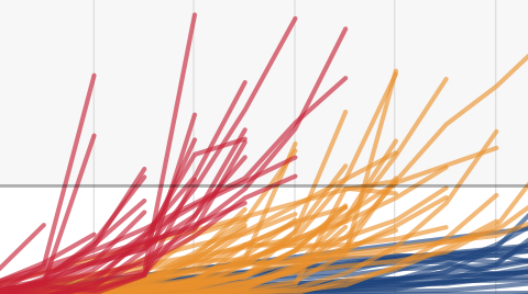
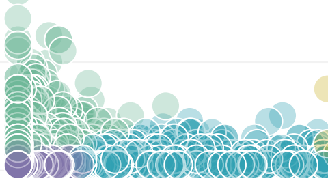
Norway Vehicle Registration
This #VizOfTheDay by Yasushi Ishikawa explores Norway's dynamic shift towards clean energy in the automotive scene using percent of totals to highlight key data points. A Back 2 Viz Basics #B2VB entry that showcases vehicles registrations and types.
Interact with the vizTableau Community
Have a question about Tableau? Find advice from experts on everything, from using the product to industry solutions. we’ve got user groups and forum topics for you. Join today!
Learn Tableau your way
Whether you’re an experienced user or just building your data muscles, we can help you level up your Tableau game.
Try Tableau for free
When it comes to elevating people with the power of data, only Tableau combines a laser focus on how people see and understand data with the kind of robust, scalable platform you need to run even the world’s largest organizations.